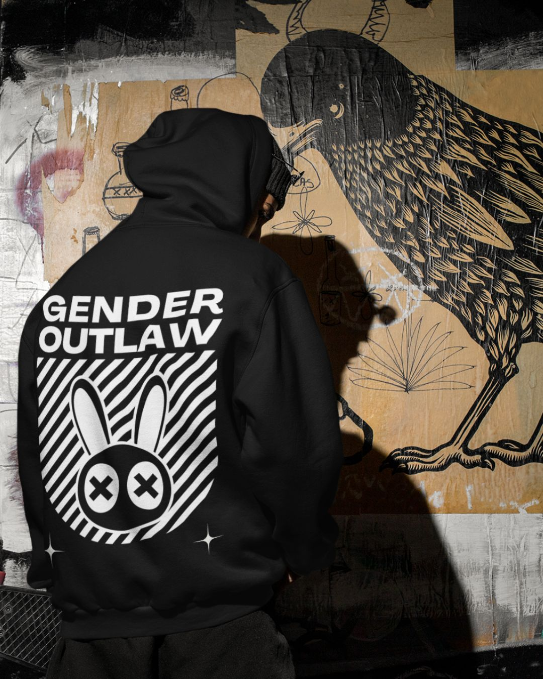
NOVA proviene del fenómeno cósmico: una nova es una estrella que repentinamente irrumpe en luz, eclipsando todo lo que la rodea. Simboliza renacimiento, poder radiante y expansión ilimitada. Para nosotros, Nova representa la luz interior de las comunidades marginadas (personas queer, trans, con discapacidad y BIPOC), que brilla con fuerza en un mundo que con demasiada frecuencia intenta opacarlas. Se trata del brillo y el poder del orgullo. Una metáfora visual del asombroso surgimiento de las personas queer y trans. Nova es la energía y la alegría que surgen al aceptar tu ser completo. Ya no estás agobiado por la vergüenza ni forzado a la oscuridad. Nova es el coraje de ocupar tu espacio y celebrar quién eres, incluso (y especialmente) cuando el mundo te dice que no lo hagas.
EDGE habla del lado crudo y sin complejos de la supervivencia y la resistencia. Es el filo de la espada, el punto de encuentro entre dos planos, el punto de no retorno. Para nosotros, Edge es la verdad de vivir al margen. Representa la determinación, la resistencia y la resiliencia de nuestras comunidades. Edge es la negativa a ser transformado, a ser transformado en formas antinaturales, aceptables para un mundo que nunca fue construido para nosotros. Es la audacia de existir bajo tus propios términos. Es una declaración de transformación, evolución y el poder que surge de permanecer al límite y seguir adelante.
Nova es la luz. Edge es la lucha.
THREADS lo une todo, tanto literal como simbólicamente. Hace un guiño tanto a la materia prima de la moda como a la cultura urbana. Threads representa la conexión. La conexión entre nosotros, desde los márgenes, a través de generaciones y subculturas. Threads es lo que nos une, a través del espacio y el tiempo. Entre familias elegidas y visiones compartidas de liberación colectiva. Cada puntada es un homenaje a nuestros antepasados QTBIPOC con discapacidad, al futuro de nuestras comunidades y a la belleza de nuestro orgullo y euforia colectivos.
Nova Edge Threads es una combinación poderosa. Nova aporta visión, esperanza, el cuidado de la comunidad y la posibilidad de un futuro libre. Con su divinidad femenina, Nova ilumina el camino. Edge aporta pasión, la verdad, la lucha y la determinación para seguir adelante. Juntos, celebran la identidad, el orgullo y la vida sin complejos.
Nuestro logotipo está construido con intención y propósito.
El logotipo en mayúsculas y negrita presenta NOVA EDGE, que se extiende por el centro. Entre ambos, se encuentra la palabra THREADS, girada y uniéndolas. El símbolo es un diseño de mosaico en forma de círculo hueco. El mosaico refleja la diversidad de nuestras comunidades. La formación circular representa la unidad en los márgenes. Representa la continuidad y la totalidad formada por la diferencia. Limpio y geométrico, pero cargado de significado. Es un símbolo de poder, transformación y resistencia queer y trans.
Diseñado para mantener la tensión: curvas suaves que mantienen ángulos agudos, reflejando la experiencia vivida de quienes viven al margen de la sociedad. Es minimalista, pero no neutral. Limpio, pero nunca soso.
Éste es un diseño intencional para una vida sin complejos.
Reimaginamos el símbolo y lo convertimos en un emblema para nuestra marca denominativa. El emblema es una versión abstracta de nuestro acrónimo —NET (Nova Edge Threads)—, que se duplicó. Representa la multiplicidad de identidad y experiencia. Se inspira en la estructura del yin y el yang: dos fuerzas interconectadas que existen en tensión dinámica y armonía. Representa cómo nuestras identidades no existen de forma aislada, sino en movimiento e interacción: estratificadas, complejas, integrales.
Al abstraer el acrónimo en esta forma, trascendemos la tipografía y nos adentramos en el simbolismo. Un lenguaje visual de interseccionalidad y solidaridad. Se convierte en un símbolo de nuestros valores: interconexión, transformación y unidad sin complejos en los márgenes.